How to Design a Cafe: 6 Common Mistakes and Fixes
How to Design a Cafe: 6 Common Mistakes and Fixes .When we dream about the ideal Cafe most of us are probably picturing stunning award-winning Cafe designs like this this or this. Problem is most of us aren’t working with the perfect Brooklyn style warehouse space or million-dollar budget. No most people are starting with a pretty ordinary space and a modest budget and the end result is shall we say not exactly award-winning.
So today I’m going to take you through six Cafe design mistakes that I come across all the time and find out what we can learn from those best Cafe designs. You know we’re going to try and sprinkle a bit of that big money magic on the humble neighborhood Cafe.
So this is probably a good time to point out that I’m not a designer myself. So these tips are coming from someone who’s owned and operated cafes and work with a stack of coffee businesses over the last 20 years. So I’ve seen a lot of design mistakes and I’ve made a few myself.
Mistake #1: Lighting
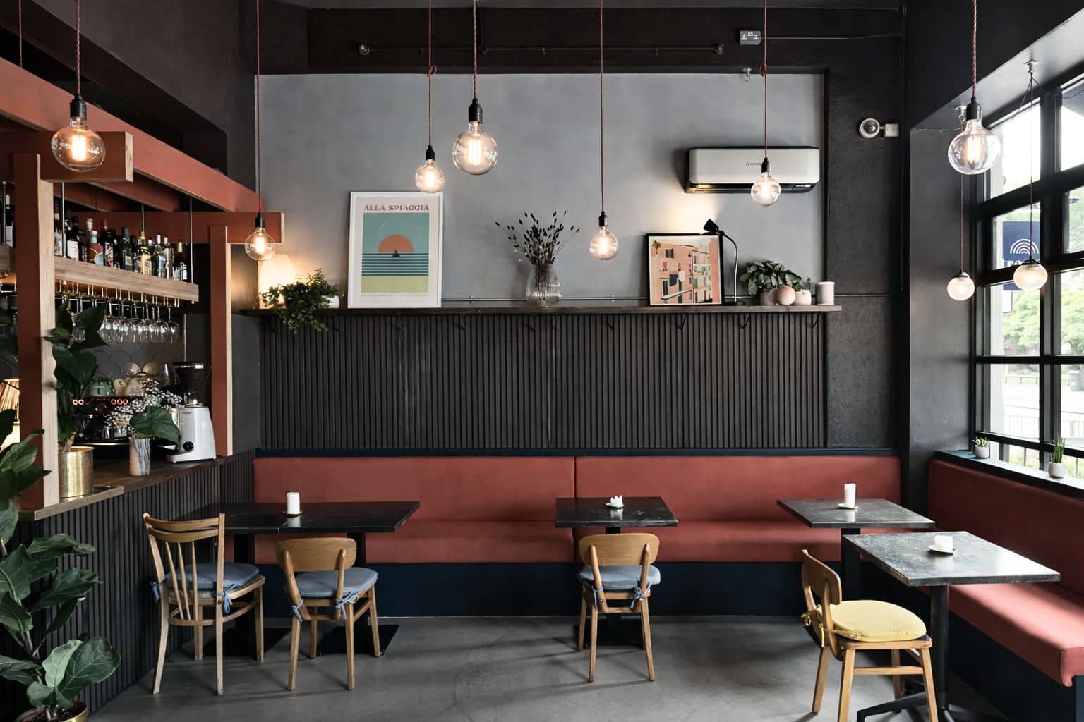
Okay let’s start with a really common one. Now think about that typical small shop on the street. The one with the narrow window front and then a long thin space that stretches away from the street.
Now the problem with this type of space is that we have a nice bit at the front with natural light coming in the window. And the rest of the shop is a miserable dark cave.
So I was tempting to fix this by flooding the space with a few bright ceiling lights. But then it just kind of feels like a hospital.
So instead here’s a better approach to lighting. First if you can make it work then the best option is to start by making the most of natural light you know the Sun. And this is one reason why Corner locations are so popular with chains like like Starbucks. They have light coming in from two sides.
Now not everyone can get a corner spot. So some cafes will add extra windows Skylight or a courtyard to make the most of the sunlight. Of course that’s not always possible and even if it is you’re still going to need to add lights.
So the trick here is rather than flooding light everywhere is to focus Lighting on certain spots. Like on tables the counter and against the walls to highlight design features. Now this tends to work best if you can use lots of smaller Focus lights rather than few high power lights. And this helps to create a better atmosphere and gives the place a more high-end feel.
Mistake #2: Clutter
Now whenever I’ve been involved in a new Cafe build the place usually looks pretty good on day one. Everything is fresh and new and everything has its place.
But then little by little the Clutter starts. First it’s a sign to promote the latest special. And then it’s the Loyalty program. Then it’s the extra cookie jars. And then it’s the sign for your uncles’s brothers yoga studio.
Now when someone walks in the fresh spacious Vibe has now become a little more clust phobic and a little less inviting. Of course the owner probably doesn’t see it anymore. When you work in a space every day it’s easy to become blind to details like this.
So try cleaning out the extra stuff. And make a rule if you add something new like a new product or a new sign then something else has to go. Oh and please stop sticking paper signs everywhere.
Mistake #3: Inspiration and Target Customer
Now if you’re designing a new cafe or planning a full renovation of an existing Cafe then it’s natural to collect a whole lot of inspiration from places you visited or researched online. You’ve got your Pinterest board or a scrapbook or you you know whatever people do. And it’s full of the beautiful colors and finishes and Novelty neon science that you love.
But before you start throwing it all together there is one really important question to ask. Who is this for.
It’s like this. The most successful businesses have a clear idea of who their ideal customer is. And they use that to guide the choices they make in every part of their business.
So when you’re reviewing all that design inspiration make sure that it’s not just about you. You want to focus on refining it to something that’s the right fit for your Target customer and fits with your brand.
Now it’s not an easy thing to do to keep the design focused and consistent. You’ll probably need to let go of some of the design elements that you love. But if you can skip the bloated design buffet and get that design on a tight diet you’ll be shredded in no time. Sorry I really have no place using a workout metaphor let’s let’s move on.
Mistake #4: Furniture
This one is pretty simple. A lot of otherwise great designs are held back with crappy furniture. That is furnish that either doesn’t fit the overall design doesn’t make good use of the space or it’s just plain cheap.
Yes some places get away with cool eccentric upcycled milk crate school desk or old barrels they found on Facebook Marketplace. But this might not work for you.
Remember my last point. You need to keep in mind your customer and your brand. You know and the fact that humans need to use these things to eat and you want them to come back.
Mistake #5: Seating Mix
Speaking of your customers think about what combinations are showing up. Is it in group groups for breakfast. Is it couples catching up for a quick coffee. Or maybe they’re all alone.
Getting the mix right can have a big impact. It seems trivial but when people are planning where to meet for coffee higher on the list is can I get a table.
So having the capacity and the right mix of tables benches or other seating can add tens of thousands of dollars in sales over a year.
So it’s worth doing a few rough mud maps of your space. Trying out different combinations of seating to find something that makes the best use of the space you have.
And for most places I think the best choice is to Source commercial furniture or get your Builder to include this as part of the quote.
Mistake #6: Bad Flow
Have you ever been to a coffee shop where things just don’t flow. The staff are in each other’s way or maybe customers are waiting awkwardly for take away coffee. It’s not a great experience for customers and it increases labor cost because staff are working less efficiently and a bad inefficient flow is way too common.
So here’s a couple of rules to make sure that doesn’t happen. First up the design should guide the customer customer now I think this is something that Starbucks is really good at. In a typical Starbucks when you walk in the front door they deliberately leave Extra Space to guide you towards the register the menu is right behind the register because that’s the info you need at that moment.
Now second part of a good flow is how quickly and efficiently your staff can work I think the best way to think about this is in zones.
DIY Design
Now at the start I mentioned those high-end award-winning Cafe designs. There is one other thing that all those designs have in common. They’re all designed by professionals.
Now here’s the bit you probably don’t want to hear. The mistake that a lot of smaller independent coffee shops make is is DIY design. But my advice is that most Cafe owners really should hire a professional designer.
I mean think about who you’re competing against. The coolest most popular coffee place in your area was most likely designed by a pro. All the big brands use professional designers.
Now I have met a small number of Cafe owners who happen to have a great IA design. But it’s pretty rare.
Most of the time when Cafe owners take the lead on design the end result is pretty average. And that can have a huge impact on sales.
Now this is advice that I’m glad I took when I was planning my own Cafe. It’s important to get right cuz customers are drawn to places that feel right. The places they go for coffee is like an extension of who they are or who they want to be.